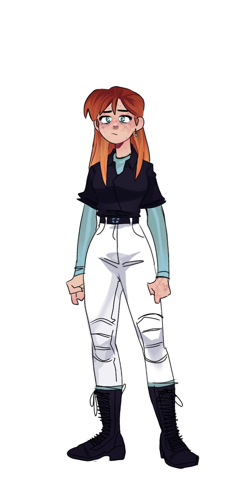
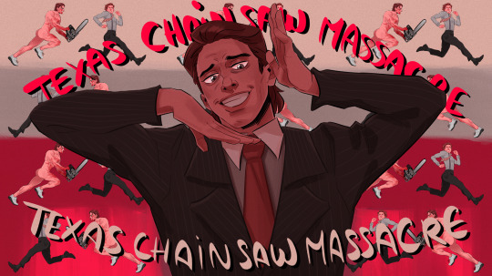
#different from my usual rendering style
Explore tagged Tumblr posts
Visit Tumblr Blog
Explore Tumblr blogs with no restrictions, modern design and the best experience.
Last Seen Tumblr Blogs


Fun Fact
Tumblr’s website traffic is steadily declining.
Text
mirrors
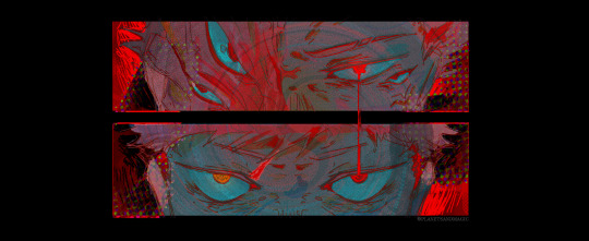
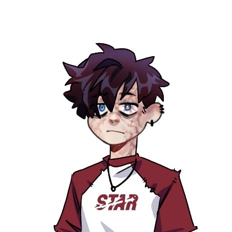
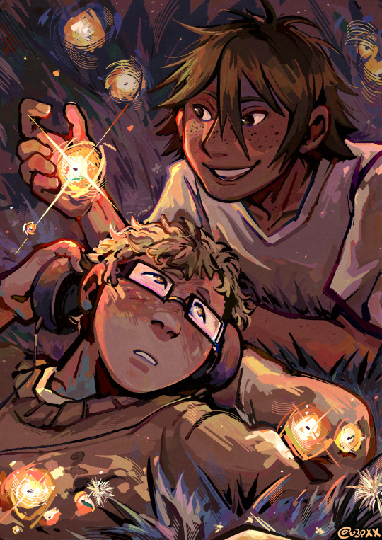
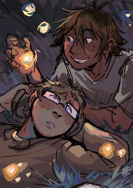
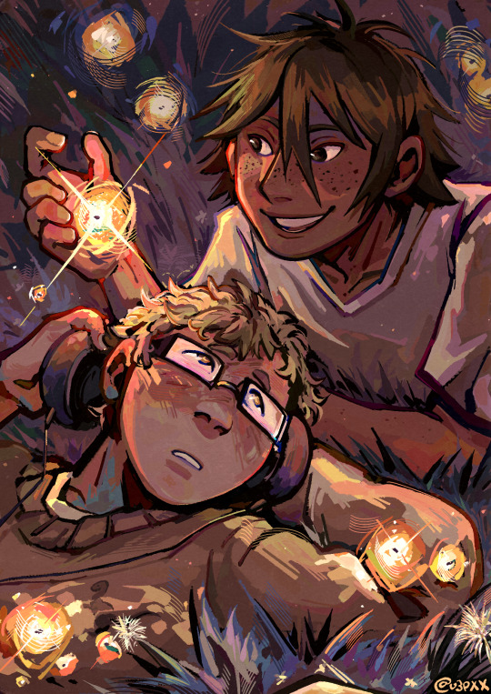
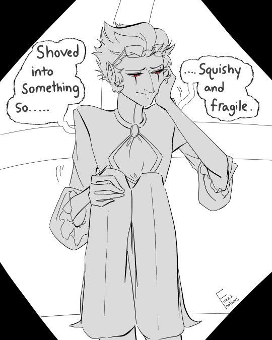
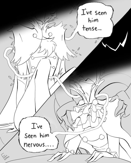
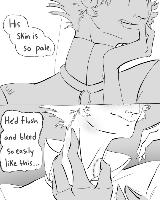
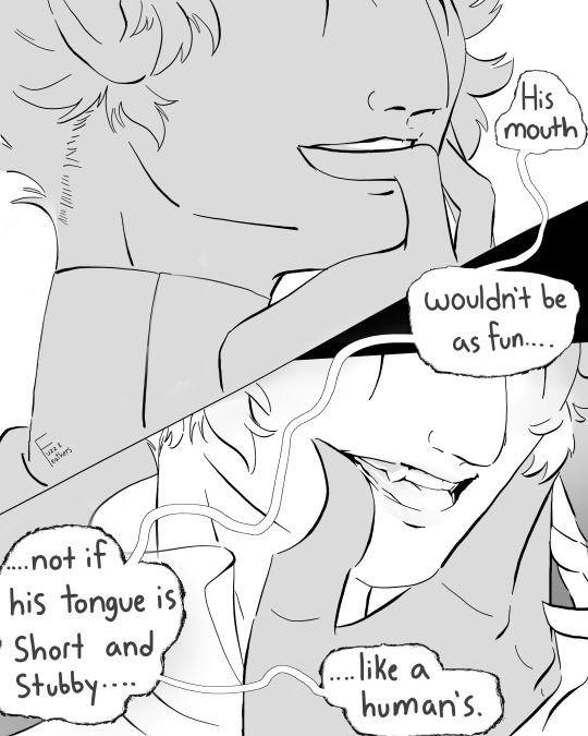
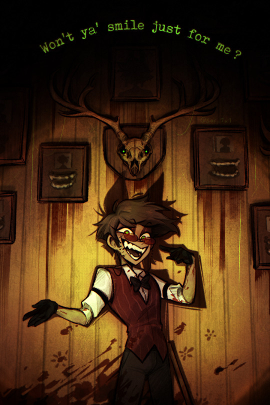
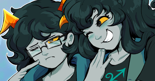
#jjk#jujutsu kaisen#ryomen sukuna#itadori yuuji#my art#artists on tumblr#jjk spoilers#jujutsu kaisen spoilers#different from my usual rendering style#this was mostly meant as a warmup + i wanted to try something new
2K notes
·
View notes
Text
But tonight, I’ll need you to stay
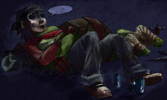
#tmnt 2012#raphael hamato#casey jones 2012#rasey#I usually have some sort of scenario or story to go with the things I draw but urhhhhh I got nothing#they have different sleep schedules after all but Raphs always been a napper in his free time#urgh idk#does anyone want to come up with something for me?#the smudged face paint I stole from less-depresso-more-espresso#I loved the idea it’s so good for story telling and I wanted to give it a try#and one day I’ll draw these guys in a different style not a messy one\#but they do suit the grungy look#the last ones of these where still neater and better rendered but idc it’s fun and easy and works#i have been consumed by these two since feb but the first thing i posted was really hard for me to do so to just spam you all now is healin#the caption is from a skng rena sent me who hasnt seen 2012 but based on me talking about Casey thought it would fit#hello rasey fandom i am here on the rasey tag making my small mark
856 notes
·
View notes
Text
Hatsune miku //oo ee oo\\
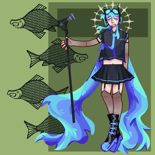
With sockeye salmon
#hatsune miku#miku redesign#gave miku googles because she deserves them#fishblr#sockeye salmon#Hatsune Salmiku#this looks so much different from my first miku fanart#evil art style challenge#don’t know if I can keep calling it my evil artstyle when I actually love doing it more then my ‘usual’ style#artists on tumblr#art#finished piece#illustration#my art#digital art#2024 art#vocaloid#hatsune miku fanart#I really like drawing miku for whatever reason so I just had fun with the design#sorta basic but I like it all the same#first time really doing rendering on the skin and I really liked how it turned out considering#I’ve had a fever for like five days straight#but it’s ok because I trust miku will save me#or the fish will save me#arrugghhhh💥#I LOVE DRAWING FISH
99 notes
·
View notes
Text
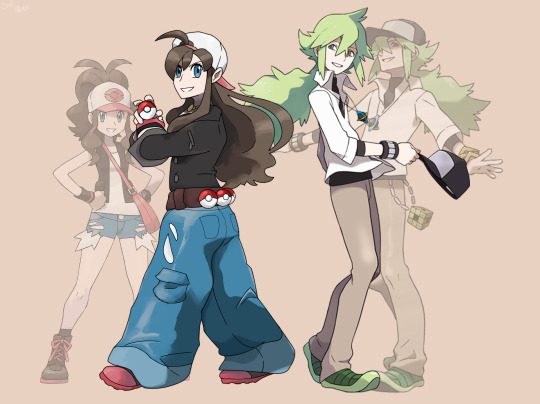
A sort of an extension of a previous piece where I drew my design for Hilda after the two-year timeskip in Ken Sugimori's style.
In that piece I used Biance and Cheren as references to reflect her role as a part of the trio, and this time I used her rival (and lanky-as-hell bf) N as a reference to reflect her role as a long-lost champion 🤍🖤
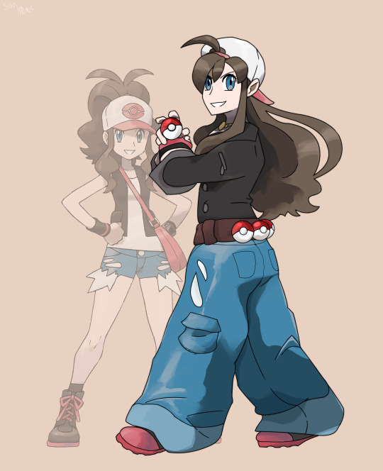
#after attempting to emulate his style twice now i gotta say this guy's artstyle is WILD#it's really light on the rendering until it's suddenly not#really fun to try out ngl since it's so different from my usual style#pokemon#pokemon black and white#pokemon unova#pokemon hilda#pokemon touko#pokemon gen 5#my art#sun-marie art#artists on tumblr#small artist#digital art#fan art#fanart#pokemon fanart
67 notes
·
View notes
Text

Sip sip 🧋
#I tried to render and actually? I like it.#I know it’s not much different from my usual style but there is still a difference#fgo#fate grand order#fate#fate go#goetia
57 notes
·
View notes
Text
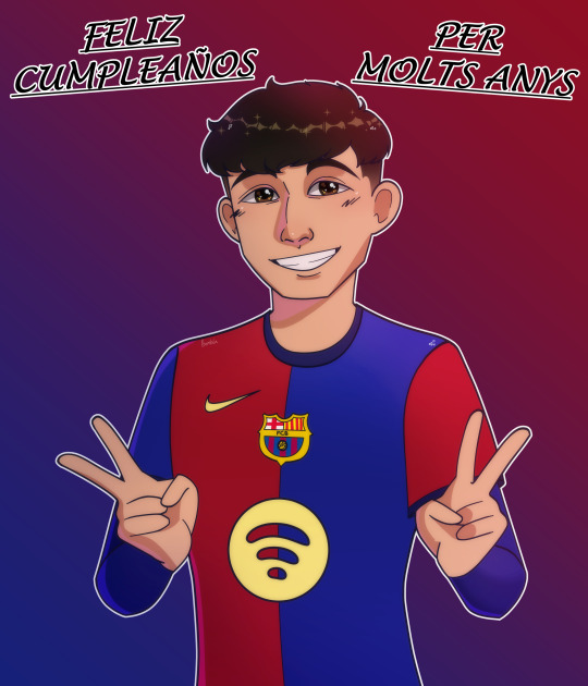
Feliz cumpleaños mi capitán o7
#pedri#bombon's art#*starts playing 22 by Taylor Swift*#anime pedri is real#listen i know its not his birthday anymore in Spain but its like 7pm (or 19:00) in california so i think im on time actually#pedri gonzalez#transparent bc i actually like it#but ngl i forgot how to render so.... thats why it's a bit different from my usual style#my dad walked in on me drawing him two different times help#fc barcelona
6 notes
·
View notes
Text
cw//blood / / / "𝘎𝘰𝘥 𝘪𝘴 𝘣𝘶𝘳𝘥𝘦𝘯𝘦𝘥 𝘵𝘰 𝘤𝘢𝘳𝘳𝘺 𝘛𝘩𝘦 𝘗𝘦𝘰𝘱𝘭𝘦'𝘴 𝘴𝘪𝘯𝘴 𝘰𝘯 𝘪𝘵𝘴 𝘣𝘢𝘤𝘬."
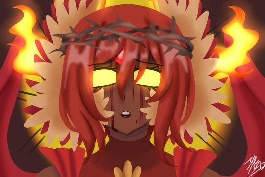
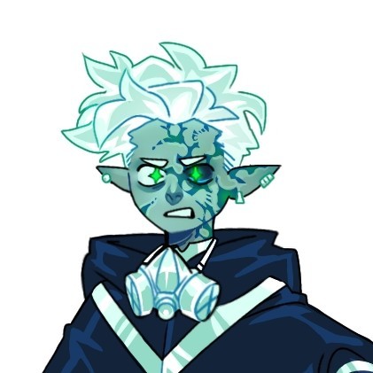
#gave Nirvana Jheva the Jesus treatment#also#i tried out a different rendering style from my usual#drawing#cfv#cardfight!! vanguard#cardfight vanguard#cardfight!! vanguard will+dress#nirvana jheva#cfv unit#my art
12 notes
·
View notes
Text

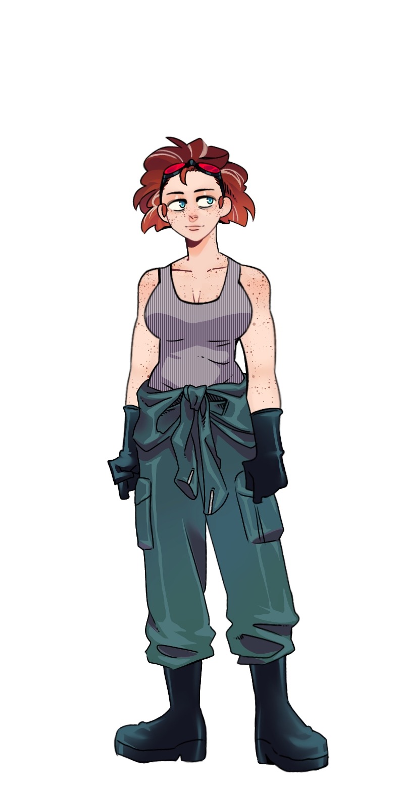
Save me Ancient builder tribe gajinkas, save me…
Structure constructors or something, idk, I never played the Minecraft.
In the nether fortress crafting my Withers, and by Withers, heh… let’s justr say.. inter dimensional societal collapse…
Usual design rant below
I believed veils would work great for the Ancient builders as not only can they hide their identity efficiently, keeping them relatively ambiguous, but also protect from the weather in the generally warmer climates they were largely stationed in, and equally work as face masks against disease and virus‘, all whilst still being able to be stylised in different ways, allowing the shape language to remain distinct.
Other visual inspirations were pirate and sailor clothing for the cold costal tribe, Ancient Greek and farmer attire for the warm costal tribe, and funnily enough: sci-fi desert planet Civilisation concept art for the desert tribes design.
Aswell as ofcourse their own respective structures and the loot within.
The colouration does differ in my head from what I rendered, I believe a lot of the little trinkets and details would have different colors, but I didn’t want the shillouettes to clash or melt into one another in this lineless style so here are the base colors for now, as I tried the former and it didn’t look good.
Look I know they were like a massive imperial force or whatever but you cannot tell me a group of artists inventors and architects that relied heavily on their semi sentient bio-mechanical hellspawn machines (and some necromancy) to do their bidding, bunkering up immediately once the odds were no longer in their favour, could handle a punch or two.
These people probably looked like starving artists, especially after the overworled was turned into a withering shithole for a couple years, legends was definitely a fanfiction they wrote about themselves. /j
#minecraft#minecraft lore#minecraft theory#artwork#fanart#minecraft art#artists on tumblr#mineblr#minecraft au#concept art#minecraft design
2K notes
·
View notes
Text
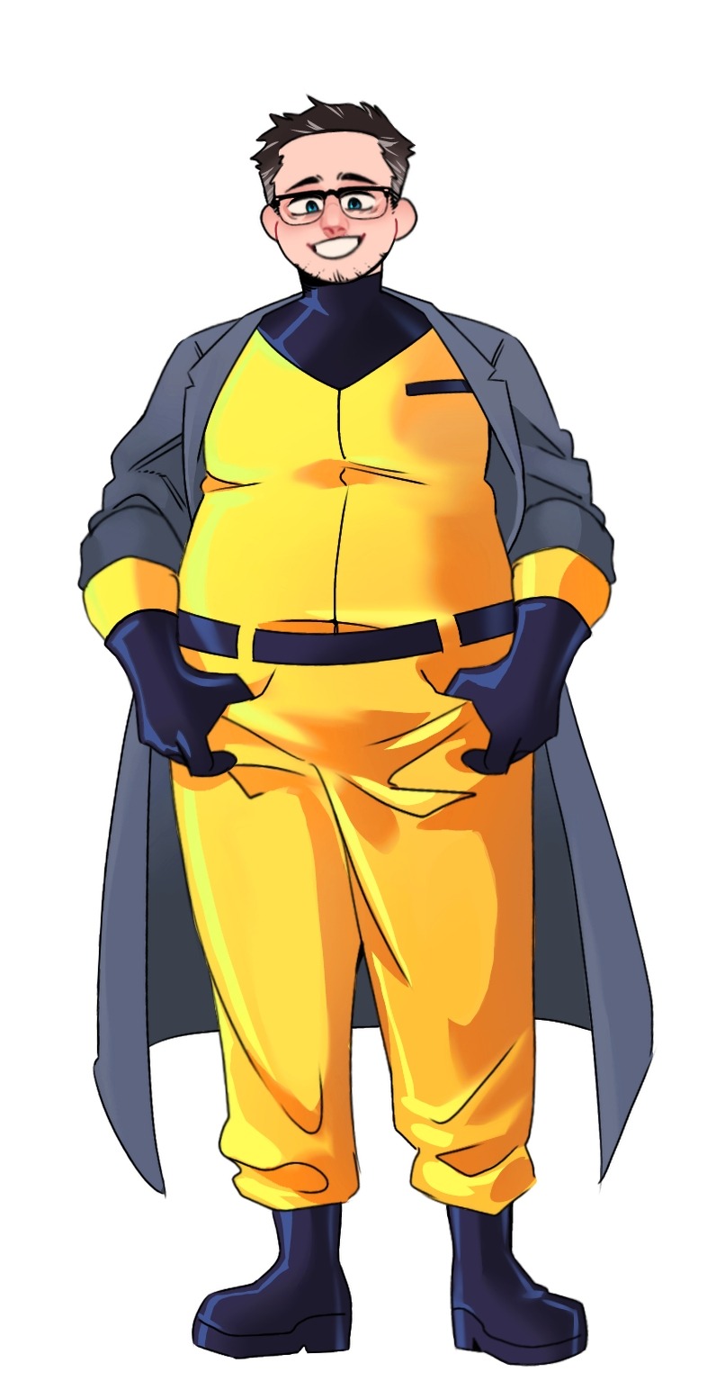
Redesigning the Fentons!!
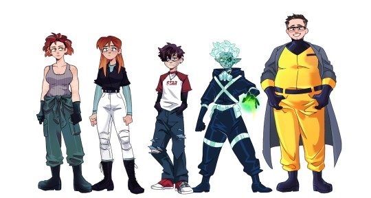
Hi yes this is for yet another Danny Phantom AU of mine it has nothing to do with the Apprenticeship AUs but unlike that batch I actually wanna turn this AU into a fic eventually once I get through a few other big projects I have *sobs*
Anyway individual files for each character under the cut along with my obligatory rambling about all the choices I made ;)
Jazz! Honestly, when I was a kid, I always thought she was 18 not 16 so it was kind of a shock when I started rewatching the show about a yr ago and heard that. Anyway, she's 17 in this AU but already moved out to college on a scholarship bc living in FentonWorks is kind of hell and she has that Older Sibling Guilt for leaving Danny there. For her clothes, I wanted it to be a mix of tactical and preppy.
Danny! (Fenton) The effects of FentonWorks hell is much more visible on Danny than Jazz because she got out of there as soon as she could. Because of that though, a lot of the chores in the lab got pushed onto Danny, without passing on many safety tips, like replacing the ecto-filtrator, cleaning contaminated tools, organizing ecto-weapons, etc. And because he doesn't know any better when it comes to safety, he has many symptoms of radiation poisoning: visually, this comes through in the discoloration/scarring on his skin (Jazz has some slight scarring on her face and hands as well), the cataract on his left eye, as well as burst blood vessels in that eye. For his clothes, I wanted them to look a bit ragged and worn through ripped seams, tears in the jeans, & duct tape around his shoe.
Danny! (Phantom) I don't actually have a lot to SAY about my choics, but I am really happy with it. There are still a few things. I wanted his hair as Fenton & Phantom to be different but still reminiscent of the simplistic rendering of the original show: Fenton is kind of timid so his hair falls over his face, & Phantom is more active/aggressive so his hair is pushed upward. The only other thing I want to comment on is his skin: it's kind of about how I usually stylize Phantom (and I mentioned this when I redesigned Dani a while back) but a "healthy" Phantom in my style would have more bright cyan skin and an unhealthy Phantom has a more dull/zombie green. And lastly, as a ghost, the radiation poisoning kind of cleans up into more neat scarring rather than the muddy/bleeding look as Fenton.
Maddie! Now, I'm gonna be honest, real vulnerable here,... I hate Maddie's canon haircut. It's ugly, I'm not sorry. But I can modify it, so it's fine: now it's curlier, a bit darker, and has a few grey streaks bc she's a genius and constantly pulling long working hours. And, it didn't come across as much as I wanted, but she's got some biceps, strong lady. Now, I'm not really sure why, but I wanted to shift the color of her and Jack's jumpsuit, making hers much more desaturated.
Jack! Big guy. I don't have many thoughts about him either, but I did give him glasses and some stubble for a little bit more dad energy (?) I mainly changed the color of his jumpsuit bc Orange is an extremely hard color for me to render for some reason, so now it's the classic Hazard Yellow. Finally, the most notable difference is the coat I put on him for a bit more scientist energy but my main reasoning for it is the potential visual of him being an absolute tank jumping from overhead with the ghost gauntlets and his coat flapping behind him. Also, I generally like the idea of him presenting himself as a big, dumb teddy-bear, always smiling, but completely unhinged below that facade: dropping the smile or not while towering over you in shadow. Wild imagery.
FINAL THOUGHTS: Do not count on any actual steps towards creating this fic in the near future, it's just on my mind right now, but I NEED to finish my other projects first 🙏🙏🙏 That said, I will (eventually) get around to a handful more character redesigns for this AU including: Vlad, Sam, Tucker, Valerie, Paulina, and maybe Lancer & Dash
#danny phantom#fanart#my art#33xhausted art#character redesign#Radiation!AU#maddie fenton#jack fenton#jazz fenton#danny fenton#bad parenting
2K notes
·
View notes
Text
happy tsukkiyama day to those who celebrate 🌙⛰️✨
like this art? it's a print, here! | like what i do? support me on ko-fi!
i'm so bad with dates i didn't even realize today's numbers were 11 and 12 ASKSKS (also i missed POCKY DAY? man, i had an idea for a doodle for that but oh well. i'll still draw it fdgfdhd)
i almost panicked about not having any art for tskym day bc cmon.... they're my boys........ but thankfully i had a deadline to finish some art prints last week and now here we are pftt
the process for this one is a little different from what i'd consider my usual way of drawing. i usually do lineart, flat colors, rendering, and yadda yadda, but maybe it's because i've been doing a lot of painterly disco elysium art lately that i decided to just paint over the scaled-up thumbnail and see where it takes me! (you can see in the timelapse me struggling over cleanly inking tsukki's face before i went 'screw this' LOL)
drawing this was pretty fun! i always wanted to try out my painterly style outside of disco elysium fanart and now i've done it! (well, done it again, bc i've kind of tried it for kghn day too pftt)
there is still something very charming abt the thumbnail in my humble onion, i don't think i was able to retain the exact silent tenderness in tsukki's face from the thumbnail in the final thing but oh well, c'est la vie dghdj (also me drawing yammers with visible nostrils jumpscare [this is only funny to me ASKSK])
#haikyuu#haikyuu!!#tsukishima kei#yamaguchi tadashi#tsukkiyama#tsukiyama#sunnysidedraws#sunnysideball#described#id in alt text
1K notes
·
View notes
Text
This comic takes place during Seeing Stars while Blitz and Stolas are on their way to the studio!
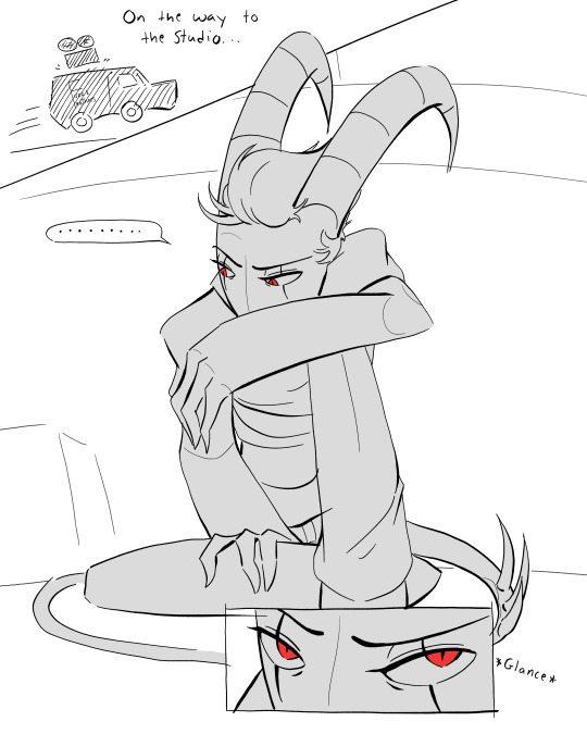


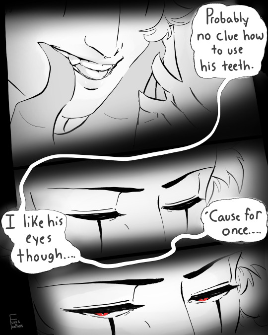
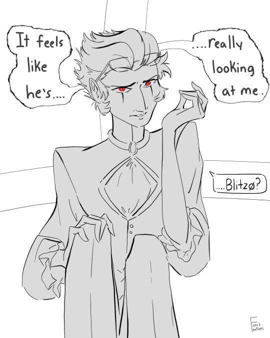

Hope you enjoyed! Mild art ranting below the cut 😂
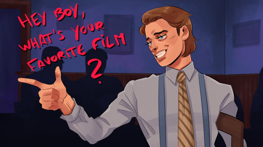
I had to drag this piece kicking and screaming over the finish line. When I first got the idea and started working on it, I had a very different rendering approach I was experimenting with. I finished the entire comic in that style then immediately decided I hated it 😂 I liked the lines for the most part, but not enough to keep, so in the end I just... redrew the entire thing using the original as a reference (don't do what I do). And still this comic irks me. From a technical perspective I actually like it quite a bit; I'm satisfied with the way I drew Blitz and Stolas, at the very least. But in terms of what the comic evokes(?) I'm not not 100% happy with it (or even 90%). It's like a 'this art doesn't make me feel what I wanted it to make me feel' type of dissatisfaction, which is, unfortunately, kinda tough to resolve. I'm a big believer in embracing your failures (and in moving on when frustration is no longer serving you) so this was getting posted no matter how it turned out and eventually I'd run out of desire to work on it further. But I still wanted to let some of these feelings out because it's been awhile since art made me feel that way! And I think it's nice to let other people see the artist perspective sometimes even when it isn't totally positive. On the bright side, it was fun to experiment with a lot of things in this piece! Also this comic was actually finished weeks ago and I've already moved to a better place with my art. This kind of frustration is usually a precursor to growth anyways, so it's best to just be patient and ride it out 😌 Hope this little rant wasn't too much of a downer! The last thing I want is to take away people's enjoyment of the art by being too critical of myself <3 Here's a little peek at the original style! In retrospect, it actually wasn't that bad, I'm just more a fan of the starker, un-rendered look I eventually went with:
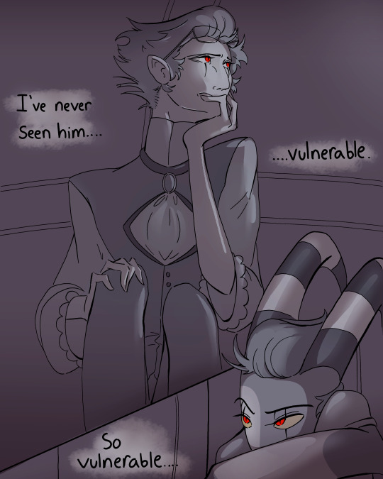
#I've never wanted to make comics the way I do with these 2 idiots <3#which is nice because I'm learning so much 😌#having to draw blitz in that fucking wig while keeping a semi-serious tone was fun 😂#helluva boss#stolas#blitzø#helluva boss fanart#stolitz#my art#2nd attempt at posting 😌 I think tumblr didn't like this one
530 notes
·
View notes
Text
Very different from my usual style. I have trouble not over-rendering shit so I tried a simpler art style, based off the Red Flags music video
#american psycho#patrick bateman#paul allen#paul owen#patrick bateman x paul allen#dorsia boyfriends#american psycho fanart#my art#featuring pat's absolute dump truck in the background
1K notes
·
View notes
Text
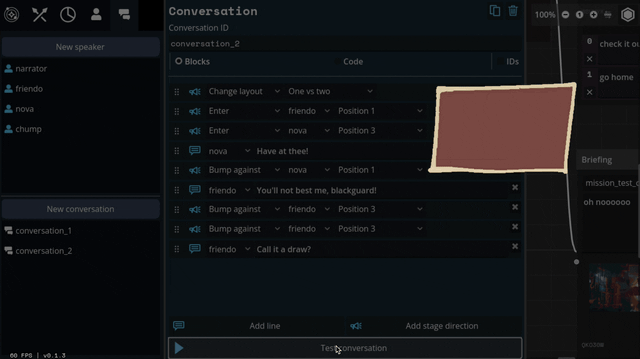
Lancer Tactics dialogue layout crisis of faith
(from this month's backer update)
Every so often, I'll run into something in development that eats away at me until it pushes me to a crisis of faith and I have a breakdown, burn down a bunch of work, and build something better from the ashes. These are moments of transformation and we're almost always able to come out the other side with something much better than what we started with.
This all sounds very dramatic until you take a step back and see the issue in question is just, like, the layout of a menu. But if medieval priests were able to have schisms over angels on pins I can have strong feelings about graphic design, dammit!
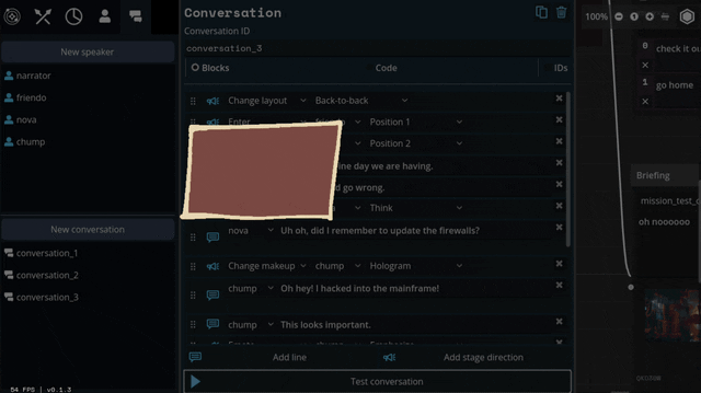
This month's episode revolved around how we're doing character dialogue. For reference the plan was to do a standard 4-slot visual-novel talking heads layout. I call it a 4-slot because there's usually four positions that characters can stand; two on the left, two on the right:
I had it ingame, and it was working. But... something felt off. Do you see the difference between every one of the above examples and this?
It's all about perspective, baby.
Answer: all the character art in those examples are drawn at a slight angle so they can be flipped back and forth to be made like they're looking at each other.
Trying to do this with the perspective we chose early — straight on — makes for a chorus line of weirdos who are looking directly into your soul as they ostensibly chat with each other. Credulity is strained; the illusion of these puppets interacting in the same space is paper-thin.
(I was skeptical of choosing this perspective for this reason, but we ultimately went with it to make the customizable assets in the portrait maker easier to fit together)
We tried a bunch of different layouts, but they all at least one of these problems:
they'd stare into your soul while ostensibly directing comments elsewhere.
they felt like text messages; this would be fine if that's what we were going for, but we wanted something that could represent face-to-face conversations. (Tactical Breach Wizards was able to pull this style off because they had little 3D dioramas to go along with it)
or, most damning of all, they felt like zoom calls.
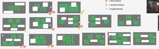
So, my heart aflutter and spirit in want, I spent a day doing a research dive into various dialogue layouts (bless the Game UI Database!) to see if any other games had managed to pull this character art perspective off. I ended up with this massive non-chronological taxonomic tree:
(fullsize here)
The type of layout that particularly caught my eye was this style where each character had their own little box. These layouts borrow a concept from comic books called "closure" where the space and time between characters are left blank. Freed from the constraints of trying to simulate a single space, these layouts allow the reader to fill in the blanks with something that feels more true-to-life than anything we'd be able to render ourselves.
I was especially impressed with the dynamism of Tales of Symphonia and The World Ends With You; rather than sticking to single slots they would animate the entire panels moving around to indicate motion an relative position of characters.
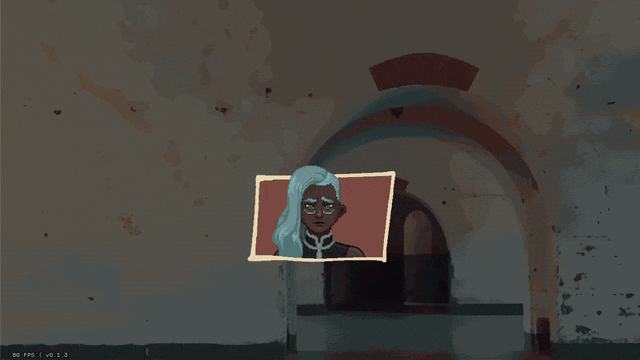
So we threw out the old code and copied them. Here's what we've come up with:
We'll be able to have portraits interact, like smacking each other (I felt like a kid hitting two action figures together, lol)
We can also apply effects like princess-leia-holograms and full-screen "lighting" effects like warning banners:
Carpenter and I came up with a number of arrangements that the portraits can smoothly transition between:
I've also implemented support for choices during a dialogue, potentially leading to branching paths.
Overall, I feel SO much better about this system than our initial designs. It might feel a little more cartoony, but I think we're making a cartoony game so that's not a problem.
Whew. We bit a lot off to chew with this project. I feel like I just made a second visual novel game engine inside of the first. Fingers crossed that it all ends up worth it.
475 notes
·
View notes
Text
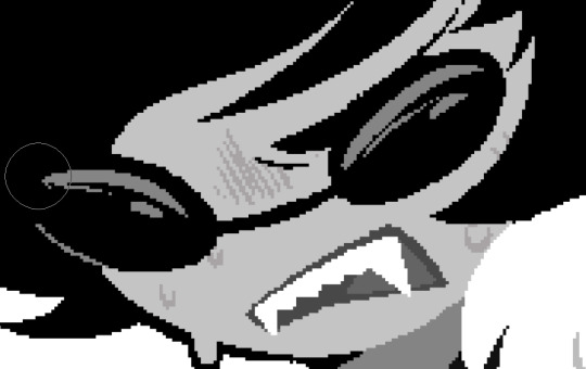
gen question: how do you recognize my art style when rendered/colored ??
having trouble doing rendered bc it looks a lot different from how I usually draw in achromatic ><
samples in render:
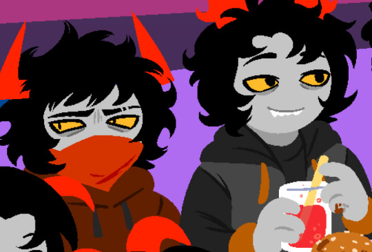
most of my rendered ones are dsmp phase kms
the other 2 dsmp artworks are since I was using nothing but a defective monitor and a computer mouse 🔥
#messyr#PLS COMMENT ;O; im trying to figure this out#i hardly post rendered ones too cuz theyre time consuming for me and based on my sched i dont rlly have much free time#like i used to back in shs ::p#OG fans know how i render though so HAUSHUFGDFK#artists on tumblr
203 notes
·
View notes
Note
Hiii I really love your art and was wondering if you wouldnt mind showing what kind of brushes you use for your recent drawings thank you so much and i look forward to your future arts!
Of course! I've answered this a few times before but have never really tagged it properly, and I also realised that I've never actually explained what I use each brush for so I'll do that now!:
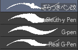
I'm gonna go through each of these brushes in order (and if i remember correctly, I'll link the top two since they arent default CSP brushes). (NOTE: almost all of these brushes have anti-aliasing turned off so that it can look more crispy and pixely!!! there is one exception to this that I will get into)
For this brush, I exclusively use it for sketching, it's advertised for inking digital manga panels, but with how the pen pressure is I feel like it adds form to my sketches
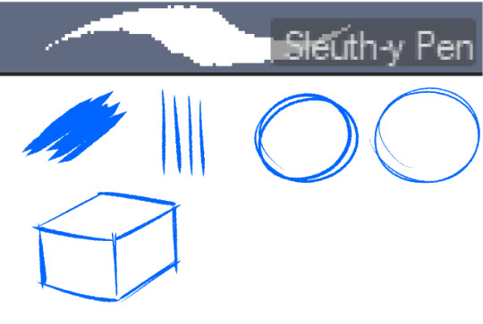

This brush, Sleuth-y Pen, is what I use mostly for MSPFA panels, mostly for lining, but sometimes for sketching too if I'm having a hard time with my usual sketching pen. It's really good if you want to replicate the homestuck style, and good for broad strokes on smaller canvases. The only issue is that the brush isn't great for that style if you use it on a larger canvas (ideally you would want 650 x 450) and can be especially messy if you're trying to get smaller details, such as open mouths, and certain facial details. I use another brush for that, which I will get into soon.
My second use for the sleuthy pen is for lineart on larger canvases in my usual artstyle! It has a texture to it that I like, as I like having my art appear a little rough around the edges, and the issue regarding small details isn't nearly as prominent of a problem
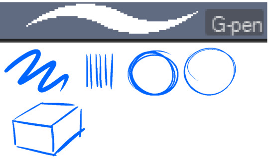
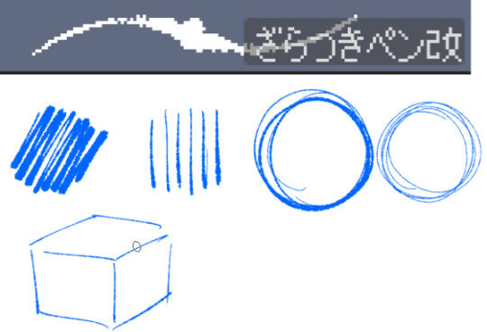
Almost done! Now we have the G-pen, a default CSP brush! This used to be one of my top 2 pens, along with its counterpart "Real G-pen" but nowadays I use it for two things: clean-up during rendering (usually getting those smaller details done that the sleuthy pen has difficulty with) and for doing SOME MSPFA panels (Vast Error, for example)
As you can see here, Liaaam's face is a little smoother than the rest of him, that's because I use the G-pen for those details, to keep things a lot cleaner! As for my other use, Vast Error's style from my understanding is a lot more "smooth" and "clean" which is why I exclusively use the G-pen for it, you can also make a lot of thick, juicy brush strokes with it which I feel works really well for the hair and folds in the clothes!
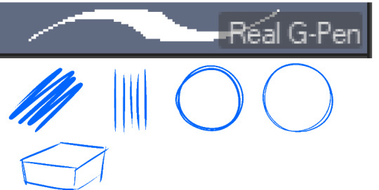
Finally, the Real G-pen, another default. This one is very similar to the last, its only differences are that it's slightly sharper and ever so slightly more messy. It's almost like a medium between the sleuth-y pen, and the g-pen.
I'll be honest, I don't use this pen much anymore, BUT, I still consistently use it for one thing and one thing only: Friendsim sprites. If you want to make friendsim sprites I highly suggest this pen, and making sure it's set to "weak" antialiasing. If you want to go the extra mile, I like to use a lasso-fill tool to block out shadows in all of my art, although if I'm using a rougher brush I'll usually do that manually. There's also other brushes I've been using more for rendering full pieces, such as a "rake brush" and a "design pencil" with low pressure to get details like blush down without making it too intense. That's basically it! I'll link the brushes below if I can find them: sleuth-y pen textured pen rake brush
193 notes
·
View notes
Note
You should tell us about color psychology that sounds cool as hell
YES… HA HA HA… YES!
GGGOD I WISH I WASN’T OUT OF THE HOUSE RIGHT NOW. but i’ve been thinking about colors literally all day so you all get to be subject to my madness! sorry this is long and rambly wauaua. nightmarishly long post under the cut.
okay. first things first, a few basics. color theory and color psychology tend to get confused a lot in discussions, but they usually refer to different things. color theory is more about we physically perceive colors (color wheels and color schemes the like), while color psychology focuses on our emotional response to colors. if you’re familiar with the children’s hospital color theory post, that poster wasn’t actually talking about color theory, but color psychology (and also it’s incredibly surface level and heavily misunderstands the subject because in what fucking universe does the quantity of positive associations with a color matter more than the context it’s used in and sorry i have personal beef with this tumblr post).
color theory is also a special interest of mine but i’m not gonna touch on it too much here because it’s not entirely important. mmmaybe another time…
essentially, certain colors (and color combinations) have associations in our brains and that affect our behavior and emotions. these associations are also very much affected by the context a color is used in. colors don’t exist in a vacuum! so while red can symbolize passion and love when used in something like a dress or a bouquet of flowers, it has a very different connotation when it’s, say, splattered on the walls or smeared on the ground in a snail trail.
or for a less Children’s Hospital Themed example, i’ll put my euphrasie and king designs here!

(of course the saturation and brightness of these blues play a massive part in how they’re perceived but this is not a post about color theory this is n)
and, of course, combining colors in a piece can also change their meanings!! i’m about to get real fucking normal.
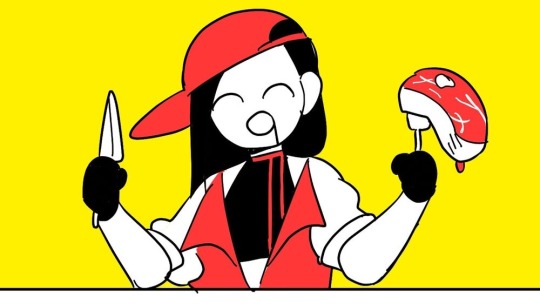
i’m gonna be focusing on the color combo of red and yellow here because it’s the one that’s most relevant to my art (and also it’s really interesting.) basically, seeing these two colors together activates the part of our brain that controls our appetite, making us actually feel hungry. this is why so many food companies use red and yellow in their branding! it’s neat stuff!!
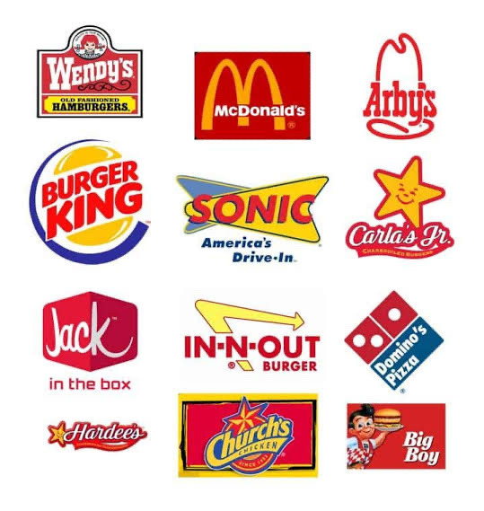
also, if you’re familiar with it, this is why the mv for butcher vanity uses this color palette!! along with red’s general associations with danger and blood, the color combo also physically induces hunger. pretty fitting for a song about cannibalism!
(there is also red’s association with lust and passion and how that intersects with the double meaning in the lyrics but i cannot derail this post into being an analysis of butcher vanity i’m sorry. we’d be here all week. maybe another day... wipes a tear from my eye)
and i think this might be the reason why some people feel hungry when they see my art, even when i’m not drawing food. while i don’t tend to use red outright, most of my art has very warm undertones (red-oranges and yellows especially), which could be activating that hunger response??

(ah fuck color theory managed to weasel its way into this post again)
admittedly this part is just speculation on my end. i think my rendering style and Shapes also play a role in it, but it’s interesting for me to think about!!
this is only scratching the surface of how complicated colors can get. i was going to go on an entire tangent about color grading and how green lighting can make a scene feel unnerving but this post is already Too Fucking Long. aaaa super sorry if this is Rambly or hard to understand!! i’m not Entirely sure how much the average person knows about color theory and psychology so if there’s any confusing terms here i’m fine with adding stuff for clarity!
wauauuaa thank you so much for asking!!!! i love talking about colors.
tl;dr colors have a bunch of different emotions and meanings tied to them, but you’ve gotta pay attention to the context in which it’s being used. so maybe take a step back before you put that thick red trail on the floor of your children’s hospital.
#marshtalkin#<- and by god did i TALK.#hhholy fuck how long is this. im so sorry i thought this was gonna be WAY shorter#admittedly i only realized colors were a special interest. fairly recently?#i genuinely didn’t consider that most artists probably don’t spend hours pacing around thinking about color symbolism#<- god don’t even get me started on color symbolism in my designs i’m so fucking normal#…do i even tag this as isat?? i mean i know i have to tag spoilers anyways#because of euphrasie#but this is mostly a post about color psychology even if i’m using my isat art as examples#aaaa whatever#isat#in stars and time#isat spoilers#color theory#color psychology#asks#also actually as a sidenote. sometimes color psychology is called a subsection of color theory?#but generally when someone is talking about color theory they’re talking about the technical side of things#terminology is weird and confusing unfortunately…
219 notes
·
View notes